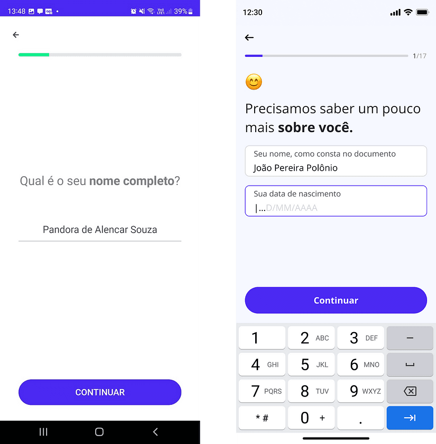
In a white-label banking product, compliance made account creation long and bureaucratic — and half of new users never finished it. In two weeks, I turned evidence from data, app-store reviews and support tickets into a shorter, clearer flow.
TL;DR — the 30-second version
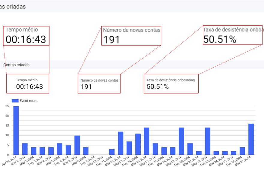
Onboarding in a compliance-heavy banking product had become long and bureaucratic. 50% of users dropped off before completing account creation, taking almost 17 minutes on average — and flooding support with avoidable tickets.
I combined BI dashboards, app-store reviews, support-team insights and a heuristic evaluation to locate the friction, then redesigned the flow around three moves: clearer communication, error feedback at the right moment, and fewer steps.
Onboarding got 4 minutes faster, drop-off fell 10% and onboarding-related support tickets dropped 46% — turning a high-friction entry point into a faster path to adoption.
01 — Where the flow was breaking
Because it is a regulated banking product, onboarding cannot simply skip steps: identity, documents and security checks are non-negotiable. But the experience around those requirements had grown long, bureaucratic and hard to complete — and it was hurting adoption where it matters most: the first session.
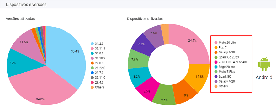
Before touching any screen, I triangulated four sources of evidence to understand where and why users were giving up.
Funnel analysis pinpointed the steps where users abandoned — half of them before finishing account creation.
App-store reviews put words to the numbers: confusion, repeated errors and frustration during sign-up.
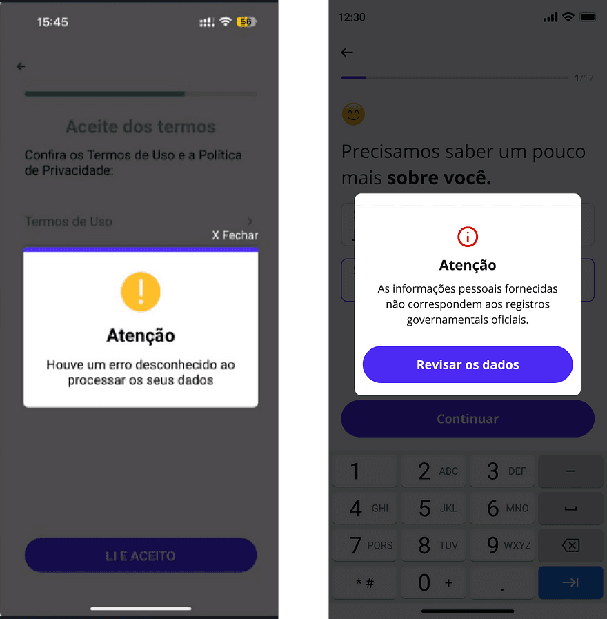
The support team's top tickets: names typed differently from ID documents, mother's name mismatches, and a temporary password users never noticed.
Together, the evidence pointed to four compounding problems:
02 — The decisions that changed the flow
The compliance rules didn't change — the communication around them did. Instructions now anticipate the three most common mistakes (abbreviated names, document mismatches, unnoticed temporary password) before they happen.
03 — The final design
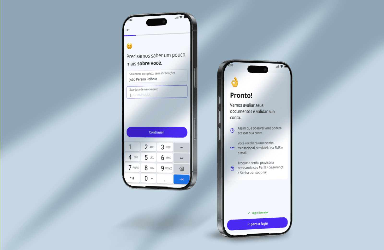
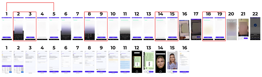
The redesigned onboarding removes friction, simplifies decision-making and guides users toward completion. Compare the same journey before and after:
Click any image to inspect it at full size.
04 — Results, with context
These are before/after comparisons of the same product metrics tracked in the BI dashboards that informed the redesign. Other initiatives may have contributed during the same period; the strongest causal signal is the 46% fall in onboarding support tickets, which maps directly to the communication and self-service changes.
05 — What I took from this
Clear communication is a design material in complex flows. In a regulated product, I couldn't remove the requirements — but rewriting how they were asked changed the outcome.
Small UX changes move business metrics. Inline validation and automatic OTP detection are modest interventions with outsized effects on time and ticket volume.
Data plus qualitative insight beats either alone. Dashboards showed where users left; reviews and support tickets explained why. The redesign only worked because both were on the table.