Case study E-commerce Web / Mobile 1-week project

How I reduced checkout abandonment by 2.4% by eliminating friction in payment selection

A high-conversion e-commerce platform was losing revenue at the last step: the checkout had a 94% abandonment rate. In one week, behavioral evidence exposed a surprising culprit — the footer.

My role: UX Research · Heuristic evaluation · Behavioral Analysis · High-fidelity Prototyping
↓ 2.4%checkout abandonment
5%of screen space — down from a footer that dominated mobile
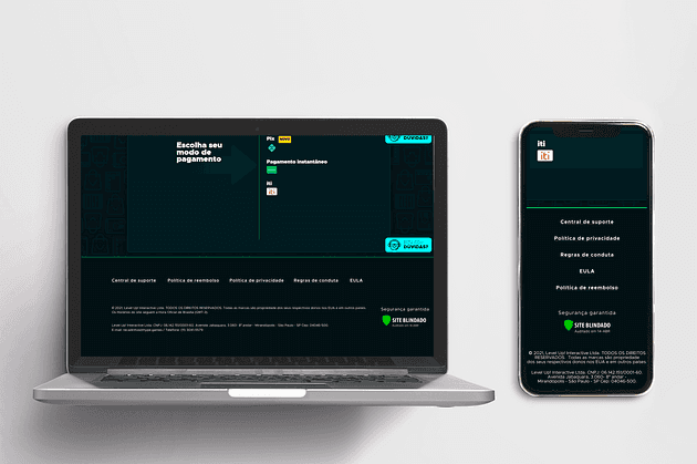
Redesigned checkout on desktop and mobile

TL;DR

The challenge

The checkout of a high-conversion e-commerce platform had a 94% abandonment rate, directly impacting revenue.

What I did

Heuristic evaluation, competitive benchmarking and Hotjar behavioral analysis revealed false affordances and a bloated footer creating friction at the decisive moment. I removed the misleading elements and rebuilt the hierarchy around the primary action.

The impact

A measurable 2.4% reduction in abandonment, a footer cut to 5% of screen space, and a checkout that guides users straight to completing the purchase.

01 — Key insights

The friction was hiding in plain sight.

False affordancesPayment method icons in the footer looked clickable but were not — causing confusion and misclicks at the most sensitive step.
Poor visual hierarchyThe checkout didn't clearly separate primary from secondary actions, increasing cognitive load and decision time.
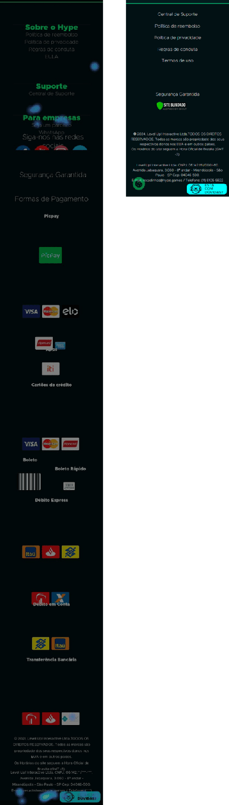
High interaction costThe footer occupied a large share of the screen — on mobile, ~70% of the scrollable content — pushing critical actions away.
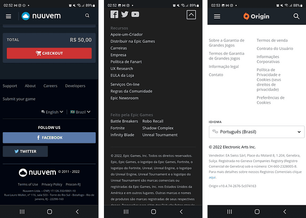
Competitive benchmarking of checkout footers
Benchmarking: competitors showed better-defined hierarchy, displayed only the essentials (terms, social, info) — and none displayed payment methods in the footer.
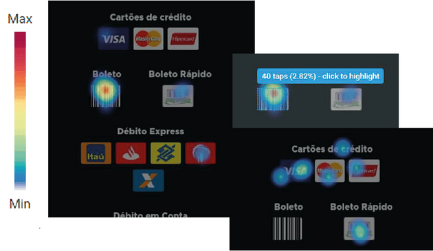
Hotjar heatmap of footer clicks
Behavioral evidence: users repeatedly clicked non-interactive footer elements — up to 2% of total clicks — confirming friction at a critical conversion moment.

02 — The decisions

Three targeted changes.

1

Eliminate false affordances

ContextPayment icons in the footer created misleading interaction signals.
DecisionRemoved all non-interactive payment method elements.
ImpactContributed to a measurable decrease in checkout abandonment.
2

Reduce the footer to the essentials

ContextThe footer occupied excessive screen space, especially on mobile.
DecisionMinimized footer content to essential information only.
ImpactReduced scroll effort and improved focus on primary actions.
3

Rebuild the information hierarchy

ContextUsers struggled to identify key actions during checkout.
DecisionReorganized the layout to prioritize payment selection and completion actions.
ImpactReduced cognitive load and improved task completion flow.

03 — The final design

A checkout that points one way: forward.

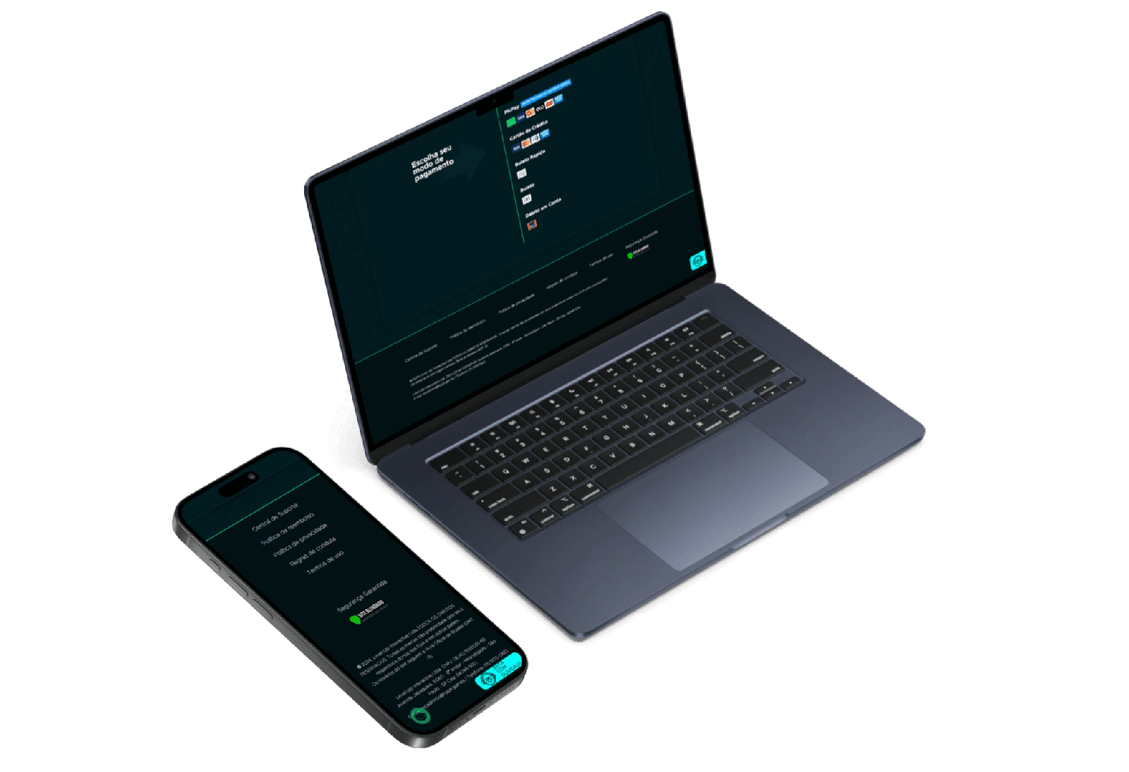
The redesigned checkout removes distractions and guides users directly toward completing their purchase.

Before Checkout before: cluttered footer with misleading elements
Cluttered footer and misleading payment icons competing with the primary action.
After Checkout after: simplified layout focused on conversion
Simplified layout focused on conversion — the footer now takes 5% of the screen.

04 — Results & learnings

↓ 2.4%reduction in checkout abandonment
5%footer reduced to 5% of screen space

Beyond the numbers: the redesign eliminated friction caused by misleading UI elements and improved clarity and decision-making during checkout.

Small interaction details — like misleading affordances or excessive UI elements — can create significant friction in high-stakes flows like checkout. By aligning visual hierarchy with user intent, it's possible to improve both usability and business outcomes with relatively simple changes.