Case study Gaming platform Web 1-week project

Increasing session duration by 8% and reducing bounce rate by 3% by optimizing color saturation

A high-traffic gaming platform built for 20–60 minute sessions used a heavily saturated blue background — RGB (0, 0, 60) — that quietly tired users out. A data-driven color repositioning fixed the fatigue without losing the brand.

My role: UX Research · Competitive analysis · Data-driven decisions · UI optimization
↑ 8%session duration
↓ 3%bounce rate
~48%reduction in blue saturation, keeping brand identity
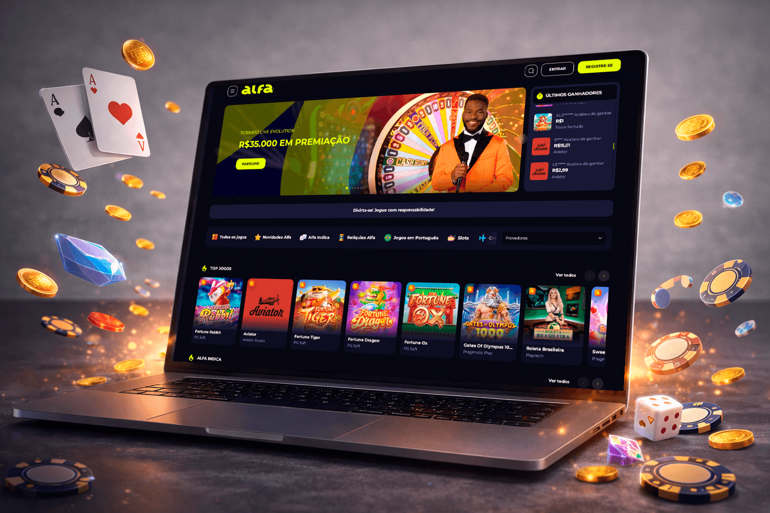
Color saturation study before and after

TL;DR

The challenge

The platform's highly saturated blue background likely caused visual fatigue over long sessions — reflected in shorter sessions, higher bounce and lower retention.

What I did

Mapped competitor RGB values, found the industry clustering between 5–35, and repositioned the background from RGB (0, 0, 60) to RGB (13, 18, 31) — ~48% less saturation, aligned with WCAG AAA contrast, without losing brand identity.

The impact

+8% session duration and −3% bounce rate. Color moved from an aesthetic choice to a usability decision backed by data.

01 — Key insights

Fatigue is an invisible churn driver.

Invisible churnUsers don't consciously identify fatigue — they associate the discomfort with the product itself. Impact: shorter sessions, lower return rate, weaker brand perception.
Differentiation can hurtThe platform used a color far outside industry standards to stand out — at the cost of higher cognitive and visual load.
Patterns encode physiologyCompetitors converged on low-saturation dark backgrounds because of long-session usability. Ignoring the pattern meant ignoring proven user comfort.
Fatigue compoundsVisual strain grows over 15–30 minutes, changing behavior mid-session: faster scrolling, lower focus, more drop-off.

02 — The evidence

Competitive RGB analysis: clustering between 5–35.

The current platform sat at RGB (0, 0, 60) — roughly 200% more saturated than the competitor cluster. The interactive charts below are the actual analysis used in the project:

Plotly · loads on demand

03 — The decisions

Color as a usability decision.

1

Color saturation optimization

ContextHighly saturated blue background causing long-session discomfort.
DecisionAdjusted from RGB (0, 0, 60) → RGB (13, 18, 31): ~48% less blue saturation, brand identity maintained, aligned with the industry cluster.
ImpactLower visual fatigue; more comfort for long sessions.
2

Data-driven color positioning

ContextColor decisions were previously subjective.
DecisionMapped competitor RGB values, positioned the color within the optimal range, applied contrast and accessibility standards (WCAG AAA).
ImpactObjective design decisions; usability consistency.
3

UX heuristics applied to visual design

ContextColor was treated as an aesthetic instead of a usability factor.
DecisionApplied Nielsen's heuristic #8 (minimalist design), accessibility standards and long-session usability principles.
ImpactLower cognitive load; higher task focus.

The shift: from aesthetic-driven ("high saturation blue → visually intense → tiring over time") to usability-driven ("balanced dark blue → subtle → comfortable for long sessions"). The new positioning aligns with industry comfort standards, preserves brand differentiation and improves the accessibility baseline.

04 — Results & learnings

↑ 8%session duration
↓ 3%bounce rate
Users don't leave because of bad design. They leave because of invisible friction.

Differentiation should never compromise usability. Industry patterns often encode real user-behavior insights, and visual comfort is a core UX metric — not just aesthetics. Data should guide design.