Case study E-commerce Web / Mobile 1-week project

Making payment selection clearer at checkout

This e-commerce checkout had a 94% abandonment rate. During a one-week review, I found that users were clicking payment icons in the footer that did nothing.

My role: UX Research · Heuristic evaluation · Behavioral Analysis · High-fidelity Prototyping
↓ 2.4%checkout abandonment
5%of screen space, down from a footer that dominated mobile
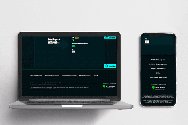
Redesigned checkout on desktop and mobile

Project summary

The challenge

The checkout had a 94% abandonment rate. I investigated whether the payment selection screen was contributing to it.

What I did

I reviewed the interface, compared other checkouts and checked Hotjar recordings and heatmaps. I found payment icons that looked clickable and an oversized footer, then removed the icons and simplified the layout.

The impact

After the redesign, checkout abandonment fell by 2.4%. The footer took up 5% of screen space.

01 — Key insights

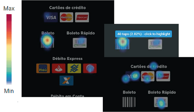
Users were clicking payment icons in the footer.

False affordancesPayment method icons in the footer looked clickable, but clicking them did nothing.
Poor visual hierarchyPayment selection and the next step were hard to distinguish from secondary links.
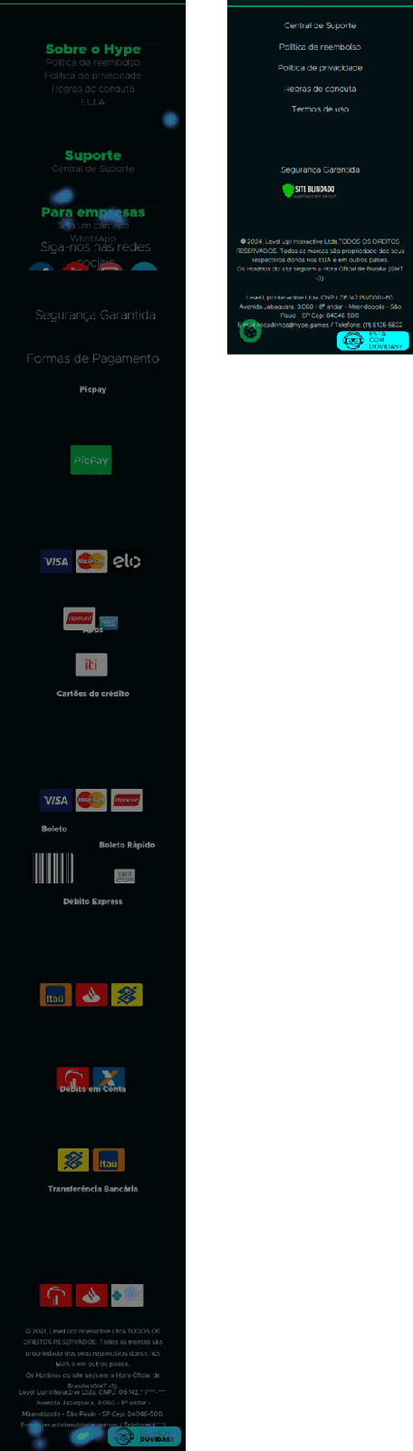
High interaction costThe footer occupied a large share of the screen, on mobile, ~70% of the scrollable content, pushing critical actions away.
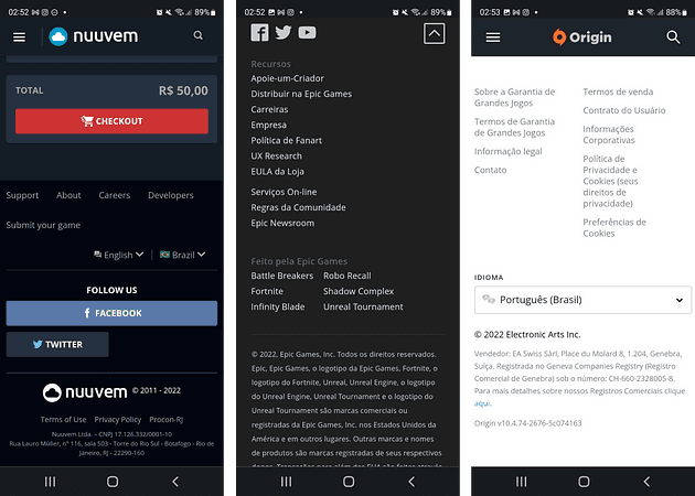
Competitive benchmarking of checkout footers
Benchmarking: competitors showed better-defined hierarchy, displayed only the essentials (terms, social, info) — and none displayed payment methods in the footer.
Hotjar heatmap of footer clicks
Behavioral evidence: non-interactive footer elements received up to 2% of total clicks.

02 — The decisions

Three targeted changes.

1

Remove misleading payment icons

ContextPayment icons looked like controls for choosing a payment method.
DecisionRemoved all non-interactive payment method elements.
PurposeAvoid clicks on icons that do not select a payment method.
2

Reduce the footer to the essentials

ContextThe footer occupied excessive screen space, especially on mobile.
DecisionMinimized footer content to essential information only.
PurposeReduce scrolling and give payment actions more space.
3

Rebuild the information hierarchy

ContextUsers struggled to identify key actions during checkout.
DecisionReorganized the layout to prioritize payment selection and completion actions.
PurposeMake payment selection and the next step easier to find.

03 — The final design

More space for payment selection.

I removed the non-interactive payment icons, shortened the footer and gave the checkout actions more prominence.

Before Checkout before: cluttered footer with misleading elements
Cluttered footer and misleading payment icons competing with the primary action.
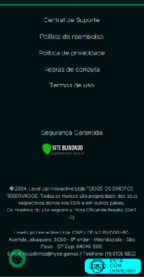
After Checkout after: simplified layout focused on conversion
The revised layout has a smaller footer, taking up 5% of the screen.

04 — Results & learnings

↓ 2.4%reduction in checkout abandonment
5%footer reduced to 5% of screen space

The main changes were removing icons that users mistook for controls and reducing the space occupied by the footer.

The Hotjar clicks helped me identify a problem I could address within a week. The 2.4% drop was measured after the combined changes, so I cannot attribute it to the footer or payment icons alone.