Case study Fintech · White-label banking Mobile 2-week project

Simplifying account creation in a banking app

Half of new users left this white-label banking product before finishing account creation. I spent two weeks reviewing product data, app-store reviews and support tickets, then redesigned the instructions, error messages and steps in the flow. I increased account creation conversion by 16.3%, reduced account creation time by 25%, and reduced onboarding-related support tickets by 46%.

My role: UX Research · Interaction Design · High-fidelity Prototyping
↑ 16.3%account creation conversion
↓ 25%average account creation time
↓ 46%onboarding-related support tickets
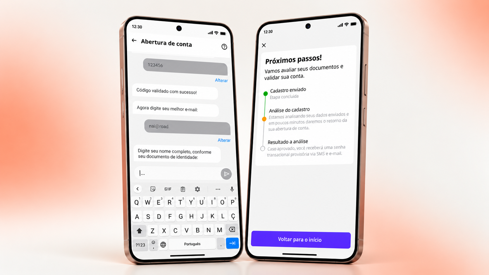
Redesigned banking onboarding screens

Project summary

The challenge

Account creation took almost 17 minutes on average, and 50% of users dropped off before finishing. Support regularly received questions about rejected information and missed verification codes.

What I did

I reviewed BI dashboards, app-store reviews and support tickets, and evaluated the interface. I redesigned onboarding as a bot-assisted chat, focusing on step-by-step guidance, timely error feedback, and fewer steps.

The impact

I increased account creation conversion by 16.3%, reduced account creation time by 25%, and reduced onboarding-related support tickets by 46%.

01 — Where the flow was breaking

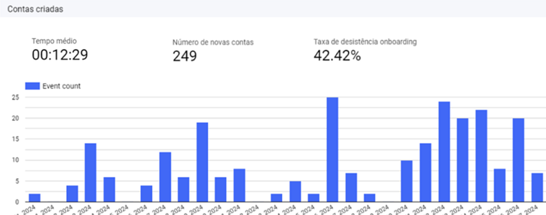
Half of all sign-ups never finished creating their account.

The product required identity, document and security checks. Users struggled with the instructions and error messages around those checks, and many left before opening an account.

I used four sources to understand where and why users were giving up.

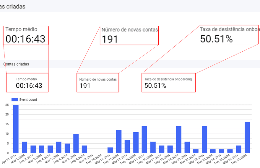
50.51%drop-off during onboarding (BI dashboards)
16m 43saverage completion time
35%of app-store complaints were about onboarding
BI dashboard showing onboarding drop-off funnel
Data

Funnel analysis pinpointed the steps where users abandoned, half of them before finishing account creation.

Support insights on most common onboarding issues
Support insights

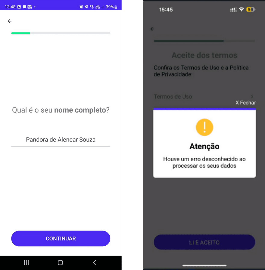
The support team's top tickets: names typed differently from ID documents, mother's name mismatches, and a temporary password users never noticed.

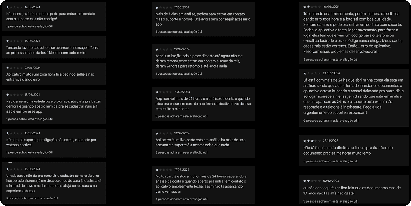
App store reviews complaining about onboarding
User feedback

App-store reviews described confusion, repeated errors and frustration during sign-up.

The review pointed to four problems:

Insight 1Vague, generic error messages left users guessing what went wrong, leading to repeated mistakes and support calls.
Insight 2Too many steps and unnecessary inputs stretched completion time, raising drop-off.
Insight 3Users depended on support for simple actions the interface could handle, raising operational cost.
Insight 4Errors surfaced too late in the flow, forcing users to backtrack or restart.

02 — How I used AI in the process

How I used AI in the process

Finding patterns across multiple apps

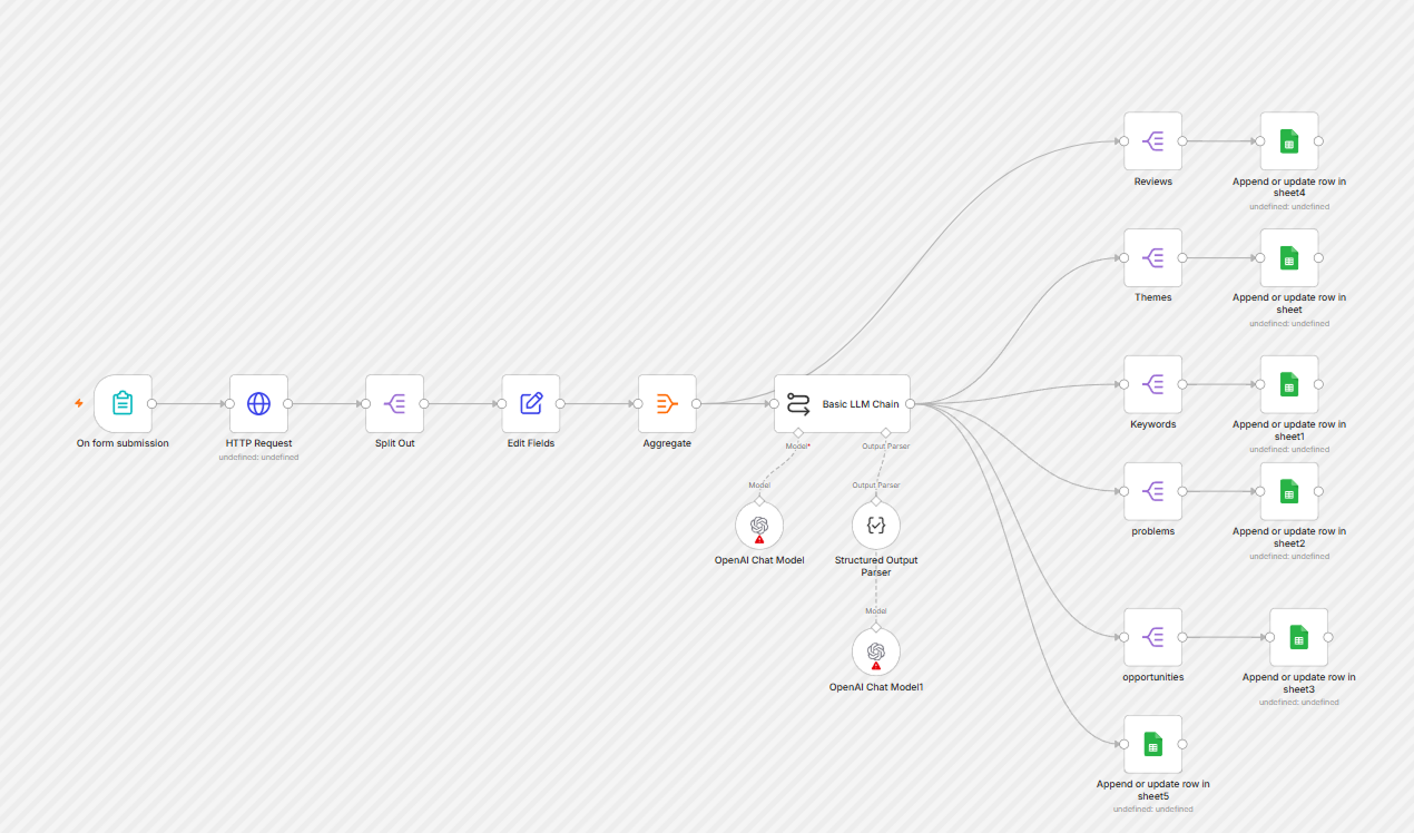
Because the product was white-label, user feedback was spread across several client apps. I built an automated workflow in n8n to bring those reviews together and analyze them consistently.

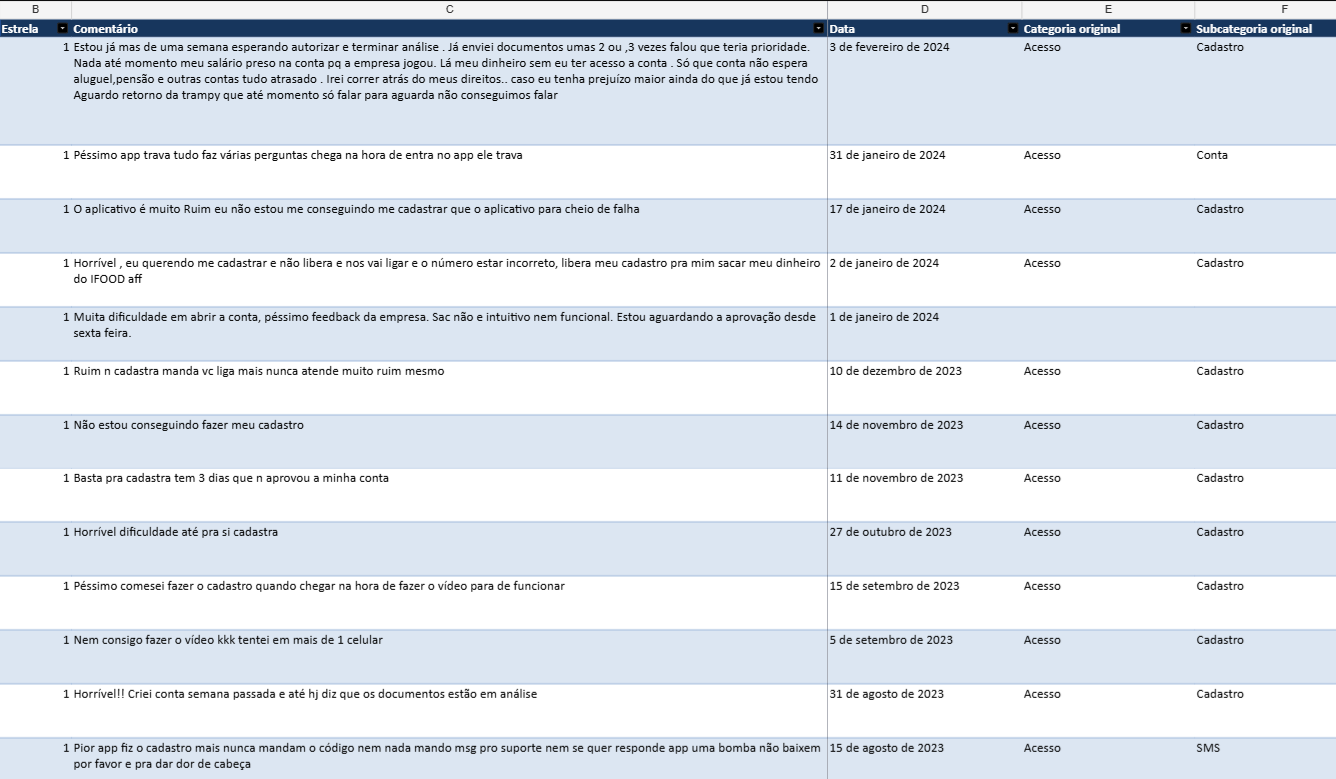
The workflow took each app’s Google Play Store link, extracted its app ID through a script, and used SerpApi to collect the reviews. After preparing the data in n8n, I passed the comments to a ChatGPT AI agent to group them by theme and surface recurring user-reported issues. Each review was saved in a spreadsheet with its date, rating, category, theme, keywords, and identified problems.

I then isolated the reviews related to account creation and ran a more focused analysis to identify recurring onboarding pain points. This connected scattered feedback across client apps and helped clarify the problems users described during sign-up.

App store reviews complaining about onboarding
The workflow I designed in n8n to collect Play Store reviews and analyze user feedback.
App store reviews complaining about onboarding
From reviews across multiple white-label apps to a focused set of onboarding pain points.

03 — The decisions that changed the flow

What I changed in the onboarding flow.

1

Explain rejected information

EvidenceVague error messages were the #1 theme in reviews and support tickets, names and documents rejected without explanation.
HypothesisClearer instructions could help users submit the information correctly.
Design decisionAdded precise input guidance aligned with compliance rules, and replaced generic feedback with specific, actionable error messages.
Expected effectFewer input errors on first try; fewer tickets asking "why was I rejected?".

I rewrote the instructions to address abbreviated names, document mismatches and missed temporary passwords while keeping the same compliance requirements.

2

Move feedback to the moment of the mistake

EvidenceErrors were displayed late in the flow, often after users had already progressed, forcing restarts and backtracking.
HypothesisShowing an error earlier could reduce backtracking.
Design decisionAdded validation to individual fields so users can correct errors before moving to the next step.
Expected effectUsers can correct a field while it is still on screen.
3

Remove extra steps and allow corrections

EvidenceThe flow demanded too many steps and inputs; users relied on support for corrections the UI could allow; the OTP code often went unnoticed.
HypothesisFewer inputs and easier corrections could shorten the process and reduce support requests.
Design decisionReorganized the flow to ask essential data first, removed unnecessary inputs and confirmation steps, implemented automatic OTP detection, and let users correct their own data in place.
Expected effectLess time filling out forms and fewer requests for help with corrections.
4

Guide users through a chat-based onboarding flow

EvidenceReviews and support tickets showed that users struggled to understand what information was required, why it was rejected, and how to correct it.
HypothesisA guided conversation could make account creation easier to follow by presenting one request at a time and providing instructions where users needed them.
Design decisionReframed onboarding as a bot-assisted chat, bringing data entry, contextual guidance, and actionable error feedback into the same conversation.
Expected effectLess uncertainty at each step and fewer interruptions to seek help from support.

The chat format was a way to bring guidance into the flow itself. Instead of asking users to interpret a full form, the bot could introduce each request, explain what was needed, and help them move through the required checks. The goal was to make a complex process feel more manageable while preserving identity and security requirements. The bot-assisted chat requests essential information first and provides guidance at each step. Users can edit their information in place, and the OTP code is detected automatically.

04 — The final design

Account creation, guided through a conversation.

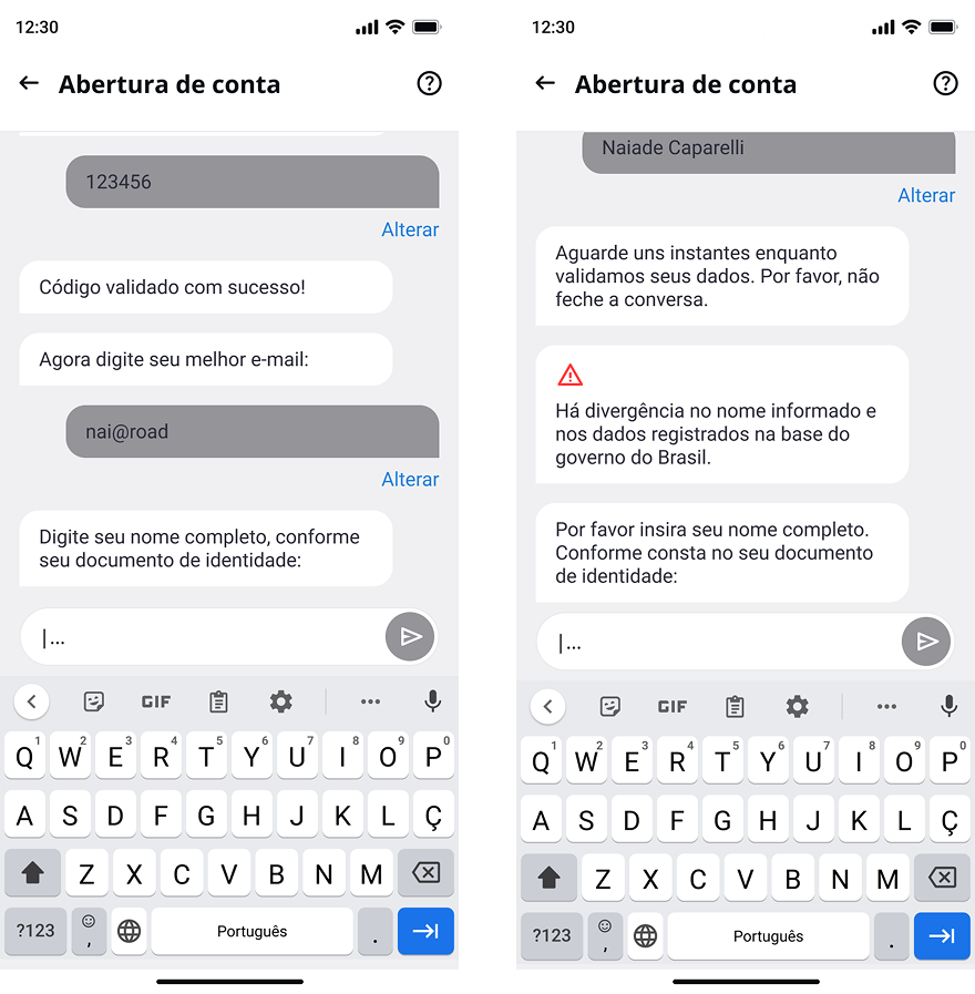
The redesigned experience brings instructions, data entry, and error feedback into a bot-assisted chat, guiding users through the required checks one step at a time.

Before Onboarding before the redesign
Long forms, generic errors at the end of each step, and a temporary password easy to miss.
After Onboarding after the redesign
A guided conversation with essential information requested first, contextual instructions, immediate validation, and automatic OTP detection.
The account creation flow before the redesign.
The redesigned account creation flow.

05 — Results, with context

What changed after launch.

↑ 16.3%account creation conversion
↓ 25%average account creation time
↓ 46%onboarding-related support tickets
…

After launch, the BI dashboards showed a 16.3% increase in account creation conversion, a 25% reduction in average account creation time, and 46% fewer onboarding-related support tickets. These results compare the metrics before and after the redesign.

06 — What I took from this

The instructions needed as much attention as the forms. Moving onboarding into a bot-assisted chat brought guidance into each step while keeping the required identity and security checks.

Corrections were part of the flow. Field validation and automatic OTP detection addressed problems that had been sending users to support.

Support tickets helped explain the drop-off. The dashboards showed where users left. Reviews and conversations with support gave me specific problems to investigate at those steps.